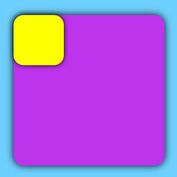
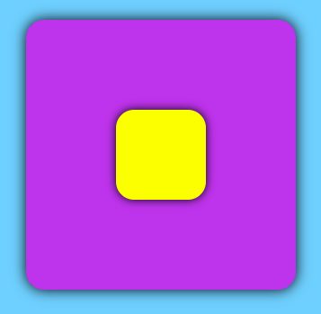
CSS 实现盒子水平垂直居中的方法效果展示原始效果居中效果原始代码html 部分css 部分123<div class="father"> <div class="son"></div></div>1234567891011121314151617181920body { background-color: #6ed0ff;}.father { width: 300px; height: 300px; margin: 100px auto; border-radius: 20px; background-color: #be33ec; box-shadow: 0 0 15px rgb(0, 0, 0);}.son { width: 100px; height: 100px; border-radius: 20px; background-color: #fcff00; box-shadow: 0 0 10px rgb(0, 0, 0);}实现方法flex第一种第二种12345.father { display: flex; justify-content: center; align-items: center;}1234567.father { display: flex;}.son { margin: auto;}grid第一种第二种1234.father { display: grid; place-items: center;}12345678.father { display: grid;}.son { align-self: center; justify-self: center;}absolute + margin第一种第二种1234567891011.father { position: relative;}.son { position: absolute; left: 50%; top: 50%; margin-left: -50px; margin-top: -50px;}123456789101112.father { position: relative;}.son { position: absolute; left: 0; right: 0; top: 0; bottom: 0; margin: auto;}absolute + transform12345678910.father { position: relative;}.son { position: absolute; left: 50%; top: 50%; transform: translate(-50%, -50%);}margin + transform12345678.father { overflow: hidden;}.son { margin: 50% auto; transform: translateY(-50%);}inline-block + vertical-align123456789.father { text-align: center; line-height: 300px;}.son { display: inline-block; vertical-align: middle;} CSS实用技巧 #CSS #水平垂直居中CSS 实现盒子水平垂直居中的方法https://blog.xukaiyyds.cn/posts/ca5259af/作者xukaiyyds发布于2023年4月6日许可协议 使用 FastGithub 稳定的访问 GitHub 上一篇CSS 常用经典布局 - 三栏布局 下一篇 Please enable JavaScript to view the comments